


02-20-2009, 04:39 PM
(02-20-2009, 03:50 PM)tonberry2000 Wrote: Love Popple, but I still think Peasly needs a tweak. What are you using as a ref?http://www.mariowiki.com/Image:MnL_PrincePeasley.jpg
| Important Announcement |
| Forum has been made read-only. Please click here for more information or here to return to The Spriters Resource. |

 Return of Beanbean Kingdom
|
Return of Beanbean Kingdom
|

02-20-2009, 04:39 PM
(02-20-2009, 03:50 PM)tonberry2000 Wrote: Love Popple, but I still think Peasly needs a tweak. What are you using as a ref?http://www.mariowiki.com/Image:MnL_PrincePeasley.jpg 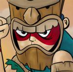
02-20-2009, 05:02 PM
I don't really like how he looks but it's because I'm not into that style.
I think I'll like if it was made in the style that the mario in your sig is. *Off topic* Why did you change your sig? I made it look awesome. *cries* Kidding! 
What M&L game is that peasley art from? Because the face is ugly.
02-20-2009, 05:56 PM

02-20-2009, 06:40 PM
Aw, someone made a M&L3 Popple before me. Also maybe you should just use the darkest shade of green instead of the weird looking black ends to his eyes.
02-20-2009, 07:57 PM

02-21-2009, 08:38 AM
What are you guys going on about, the sprite work and the artwork look the exact same :/
Popple's done
![[Image: ppeasley-3.png]](http://i119.photobucket.com/albums/o156/A1exi_911/ppeasley-3.png)

02-21-2009, 11:29 AM
I like this... There's some thing about Popple... hes too happy or something

02-21-2009, 12:11 PM
Try making Peasley's eyes about a pixel shorter. That should fix it for good.
02-21-2009, 07:07 PM
He's either walking backwards or that's a fancy new dance.
02-22-2009, 09:57 AM
I didn't animate the old one properly
![[Image: pppfgood.gif]](http://i119.photobucket.com/albums/o156/A1exi_911/pppfgood.gif) better? also, Croshi, fawful's teeth are like this =/ |
|
« Next Oldest | Next Newest »
|
![[Image: popple.png]](http://i119.photobucket.com/albums/o156/A1exi_911/popple.png)
![[Image: pppf.gif]](http://i119.photobucket.com/albums/o156/A1exi_911/pppf.gif)
