10-17-2010, 06:02 PM
![[Image: bof_4___dragon_quest_slime_by_neslug-d30yx0m.gif]](http://fc05.deviantart.net/fs70/f/2010/290/5/1/bof_4___dragon_quest_slime_by_neslug-d30yx0m.gif)
Breath of Fire 4 X Dragon Quest. Specifically, the palette and reference I used was the Eye Goo sheet.
I might make more characters from different series in this style, it's great practice.
| Important Announcement |
| Forum has been made read-only. Please click here for more information or here to return to The Spriters Resource. |

 Trying a style that is not overused
|
Trying a style that is not overused
|

10-17-2010, 06:02 PM
Breath of Fire 4 X Dragon Quest. Specifically, the palette and reference I used was the Eye Goo sheet. I might make more characters from different series in this style, it's great practice. 
10-17-2010, 06:17 PM
idk, the face looks misplaced
but awesome animation as always! 
10-17-2010, 06:24 PM
(This post was last modified: 10-17-2010, 06:25 PM by ~DrakoRero~.)
The face does look slightly misplaced, I think it's the eyes, but
ITS BEAUTIFUL. 
10-17-2010, 06:26 PM
the close eye is a bit too far down and they both jump pretty far in certain parts of the animation
10-17-2010, 06:35 PM
(10-17-2010, 06:26 PM)Cure For Cancer Wrote: the close eye is a bit too far down and they both jump pretty far in certain parts of the animation Hmm really? The close eye was originally one pixel higher but as I tried setting it into an isometric grid it didn't look quite right. Did you see the ref I linked to in the first post? ![[Image: slimeeye.png]](http://img689.imageshack.us/img689/2605/slimeeye.png) I moved the eye up one pixel. Cue voting, #1 or #2. 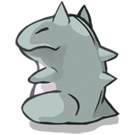
10-17-2010, 06:43 PM
I think if the mouth was a little more to the right to be more centered between the eyes.
10-17-2010, 06:58 PM
I'm not sure if you noticed from the 1x scale picture, but the mouth itself goes a few pixels beyond the pink tongue.
![[Image: slimeface.png]](http://img41.imageshack.us/img41/2093/slimeface.png) No shading version. 
10-18-2010, 11:56 AM

10-18-2010, 07:09 PM
2.
but i'd move the right eye 1px down. ![[Image: bof_4___dragon_quest_slime_by_neslug-d30yx0m.gif]](http://fc09.deviantart.net/fs70/f/2010/292/3/d/bof_4___dragon_quest_slime_by_neslug-d30yx0m.gif) Moved the right eye down by 1px and touched it up a little to look better. 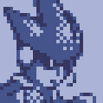
10-19-2010, 09:45 AM
Awesome work. And consider that 'douch' removed.
|
|
« Next Oldest | Next Newest »
|