



05-15-2010, 02:14 AM
i actually liek all of them quite a bit
| Important Announcement |
| Forum has been made read-only. Please click here for more information or here to return to The Spriters Resource. |

 rad dad chad had rad dad pad
|
rad dad chad had rad dad pad
|

05-15-2010, 07:27 AM
I like the blond, but that seems so...normal for a hair streak choice.
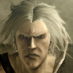
 ![[Image: raddadchadhadmadradpad.png]](http://img514.imageshack.us/img514/1955/raddadchadhadmadradpad.png) xXx fuck da hat xXx seriously i have no idea how to even begin cleaning it up and it's going to continue bugging me because everyone i've showed it to is all "naw it looks fine, just fix up the lines, it doesnt need any more shades" but because i know it's still technically a sketch and it could get away with more shades to be /in the style/ i wont stop being bugged by this aaaaaaaaaaaaaaaaa snypa 
05-16-2010, 08:19 AM
your hat looks like a cube, so it'd make more sense if you shaded like one
![[Image: pickahatufuc.gif]](http://img261.imageshack.us/img261/1077/pickahatufuc.gif) i like the normal shaped hat most so i started sloppily(heh) shading it but lets see what tsr thinks i mean they all suck but i cant get over how stupid the first hat looked in the first place so im just making new ones someone come up with a new idea for something to put on his head the checkered hat pisses me off 
a stop sign with a matcxhing shirt that says parking in my spot
actual suggestion is no hat 
05-16-2010, 06:29 PM
![[Image: 1uped2.png]](http://img265.imageshack.us/img265/5982/1uped2.png) Didn't like the face, do what you want with his hat 
05-17-2010, 09:29 PM
that hat looks horrible. i dont get why you just stick to make either everything in a grafitti aesthetic or in a realistic aesthetic.
to be honest its just personal preference so ignore me. |
|
« Next Oldest | Next Newest »
|

![[Image: raddadchadhadmadradpad.png]](http://img80.imageshack.us/img80/1955/raddadchadhadmadradpad.png)


![[Image: raddadchadhadmadradpad.png]](http://img215.imageshack.us/img215/1955/raddadchadhadmadradpad.png)
