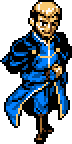
Posts: 13,131
Threads: 168
Joined: Jan 2011
honestly I feel the eyes should go over to the right one pixel, as it's looking toward us in an awkward way that bugs me which also does not quite match the mouth.
the eyes also look kinda funky, they are too squinty imo. they look like it's kinda drunk/tired/derpy/troll-y tbh.
also yes they would Crimson.
Posts: 222
Threads: 4
Joined: Jun 2009
(02-11-2013, 12:05 AM)Mighty Jetters Wrote: honestly I feel the eyes should go over to the right one pixel, as it's looking toward us in an awkward way that bugs me which also does not quite match the mouth.
the eyes also look kinda funky, they are too squinty imo. they look like it's kinda drunk/tired/derpy/troll-y tbh.
also yes they would Crimson.
Actually they were a pixel or two to the right, I shifted it to be centered. The squinted eyes thing was intentional also. I'll try submitting these to the archive, but I hope that the sheet is large enough.
Posts: 3,787
Threads: 75
Joined: May 2008
I think you could move the whole face including the mouth to the right by one pixel (and make the rightmost tooth one pixel thinner).
The tongue should bend up when retracting, meaning the tip should move further to the right before going back in. Right now it looks like it just gets shorter.
The boo's outline is broken in the bottom right.
Posts: 222
Threads: 4
Joined: Jun 2009
Mario, I made this from that edit of Mario360's sprite. I worked on it so much that there is barely a resemblance.
![[Image: mario_scratch_sprite_by_novally-d5usb68.png]](http://fc01.deviantart.net/fs71/f/2013/044/9/2/mario_scratch_sprite_by_novally-d5usb68.png)
I don't intend on making a sheet of this. If I do it will be pretty small.
Posts: 9,905
Threads: 264
Joined: Jun 2008
the selout is kinda grating for me personally, and maybe the head's perspective doesn't really match with the body. Mind the clusters and avoid lone pixels.
Posts: 607
Threads: 25
Joined: Mar 2012
the way hes leaning he will fall over, spread the legs, if their close together he'll just tip.
you should take into account the red handicap, it doesn't shade too well so you'll need to darken the darker and lighten the lighter for it to appear to follow the same lighting ramp as your other colours.
the lack of line art isn't helping its readability, line art is needed before you use selout.
considering the size of the sprite you should only have 2 / 3 shades per colour, 4 is a bit overkill, if your adamant on 4 it'd probably be wiser to use a universal darkest colour for it.
in terms of anatomy his legs are too long in comparison to his body, either make the legs shorter or body taller. (but not both, its in such a position that changing both would tip the scales)
with regards to the style the hands would probably look better if they were a little bigger too.
Posts: 222
Threads: 4
Joined: Jun 2009
@Gor
I think the head looks fine I will shift is face one pixel over though, and fix the perspective of his hat. I'm removing the selout too.
@Bomb
I'm fixing this now.
Posts: 222
Threads: 4
Joined: Jun 2009
Update:
![[Image: hdnvhJs.png]](http://i.imgur.com/hdnvhJs.png)
Posts: 950
Threads: 15
Joined: Jul 2012
his eyes need to be a tad bigger...
Posts: 432
Threads: 17
Joined: Jul 2012
Honestly less color would be needed as the sprite is so small and the shade of gray is to dark to be used as a white shadow color
The legs look like he's wearing bell bottoms
![[Image: editsmall.png]](http://img195.imageshack.us/img195/2476/editsmall.png)
Posts: 222
Threads: 4
Joined: Jun 2009
![[Image: 2ff8a4c027b7228218e5f22482af721f-d5usb68.png]](http://fc00.deviantart.net/fs71/f/2013/045/2/f/2ff8a4c027b7228218e5f22482af721f-d5usb68.png)
Going to work off Virtuaboy123's edit. I've edited his edit. Fixing some minor things I thought would bring out more of the sprite.
I'll be working on a small sheet of this now. Will try to make a 4 frame running animation.
Posts: 222
Threads: 4
Joined: Jun 2009
Deleted my last update since it was not significant enough. I'm working on the sprite more. Then I will start one one pose.
Posts: 222
Threads: 4
Joined: Jun 2009
![[Image: LPfY6Mn.png]](http://i.imgur.com/LPfY6Mn.png)
The right leg is bothering me like crazy!
Posts: 13,131
Threads: 168
Joined: Jan 2011
it's not good to actually use others' edits, that's not how you learn to fix the mistakes yourself.

Posts: 222
Threads: 4
Joined: Jun 2009
That I understand completely

, but once someone fixes the mistakes what's left to be done? That's why I try to avoid fully fixing anyone's sprites and I comment on their errors. It's hard to fix mistakes that have already been fixed. I can still learn from seeing my mistakes corrected.