


06-14-2009, 02:27 PM
![[Image: lordbullboicon.png]](http://i449.photobucket.com/albums/qq211/moffett1990/lordbullboicon.png)
![[Image: pigthing.png]](http://i449.photobucket.com/albums/qq211/moffett1990/pigthing.png)
| Important Announcement |
| Forum has been made read-only. Please click here for more information or here to return to The Spriters Resource. |

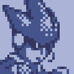
 Lord Bullbo minish cap style
|
Lord Bullbo minish cap style
|
06-14-2009, 02:34 PM
The lineart looks ok, but that shading is pretty bad.
Moved to Sprite Discussion.
06-14-2009, 03:16 PM
Yeah. There should me far more shading than that if you want this to be in-style (and accepted)

06-24-2009, 12:17 PM
![[Image: 300px-LordBullbo.png]](http://www.zeldawiki.org/images/thumb/d/dc/LordBullbo.png/300px-LordBullbo.png) thats what he looks like so does anyone have any suggestions on what i need to to to make my sprite better ?
06-24-2009, 12:19 PM
His horns look like teeth in your sprites. They're going way too far down.
Also, shading.
06-24-2009, 12:20 PM
|
|
« Next Oldest | Next Newest »
|
