Posts: 5
Threads: 2
Joined: Apr 2014
![[Image: lrya9eX.png]](http://i.imgur.com/lrya9eX.png)
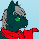
I am making a cat with a cape and need a little help and advice on how it looks so far. I am currently working on animations to move his tail in his idle animation and have his cape be blown by the wind. I am also thinking of doing an animation of him yawning and then going to sleep if not moved for long enough.
Posts: 969
Threads: 35
Joined: Mar 2010
It could use more contrast, especially on the cape. The face is difficult to read, too. The body seems OK.
Posts: 2,914
Threads: 96
Joined: Dec 2009
06-23-2014, 07:15 PM
(This post was last modified: 06-23-2014, 07:16 PM by E-Man.)
To start things off, have you ever considered using contrast in your shades? Try making the shades not only darker, but also employ some hue shifting to make it look interesting.
Welp! Looks like Midi got it first. Silly me.
Posts: 5
Threads: 2
Joined: Apr 2014
![[Image: xtjlTRR.png]](https://i.imgur.com/xtjlTRR.png)
I'm not really understanding how hue shift works all that well but I tried to make the cape more contrasted, and the face more readable. Also you said the body was "OK" does that mean it's good or does it need more work?
Posts: 969
Threads: 35
Joined: Mar 2010
The hindleg seems to have a shade that's barely visible at 1x, and the end of the cape also still has shades that are too similar. Make the darker ones on theend of the cape even darker, and the ones on the leg can be done away with entirely.
As for the body being OK, I mean the shape is good enough.
Posts: 2,914
Threads: 96
Joined: Dec 2009
(06-23-2014, 08:25 PM)Knick1225 Wrote:
I'm not really understanding how hue shift works all that well...
Try reading this to give you a better understanding.
http://www.planetminecraft.com/blog/tuto...-shifting/
Posts: 3,012
Threads: 115
Joined: May 2009
(06-24-2014, 05:41 AM)E-Man Wrote: Try reading this to give you a better understanding.
http://www.planetminecraft.com/blog/tuto...-shifting/
those are some awful color ramps
but i wouldn't expect a minecraft forum to have any spriting skill
Posts: 2,914
Threads: 96
Joined: Dec 2009
Hey, it's not perfect, but at least it has some useful insight on the concept.
Quote:Red: If your base is red, colors should get more magenta (purple) as they get darker and more orange as they get lighter
Orange: If your base is orange, colors should get redder as they get darker and yellower as they get lighter.
Yellow: If your base is yellow, colors should get more orange as they get darker. Colors should not get green as they get lighter, though. Instead, they should get purer yellow.
Green: If your base is green, colors should get more cyan (blue) as they get darker and more yellow as they get lighter.
Cyan (light blue): If your base is cyan, colors should get more blue as they get darker and more green as they get lighter.
Blue: If your base color is blue, colors should get more violet as they get darker and more cyan as they get lighter.
Magenta (purple): If your base color is magenta, colors should get more violet as they get darker and more red as they get lighter.