01-22-2014, 05:38 PM
![[Image: 448f65c1c437534e2bf056d88924d39d.png]](http://gyazo.com/448f65c1c437534e2bf056d88924d39d.png)
e: this is chrome on mac btw
| Important Announcement |
| Forum has been made read-only. Please click here for more information or here to return to The Spriters Resource. |
|
Improved Icons
|

01-22-2014, 06:51 PM
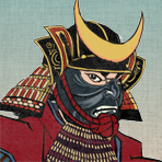
Are those Rounded Corners Necessary? No.
Is that Multi-Hue Shading Necessary? No. What about the Automatic Anti-Aliasing? NO. ![[Image: SimplifiedRevision.png]](http://img.photobucket.com/albums/v43/Luigi/SimplifiedRevision.png) The Old Icons were better because they were SIMPLE. 
05-23-2014, 09:51 PM
Simple does not automatically mean better. There are reasons for all of your complaints, covered both in the announcement thread and in my reply to your suggestions thread post. Additionally, the added complexity does not affect you in the slightest. All you're doing is submitting a rectangular image. No frills or borders or text or anything else necessary. The site does the rest of the work for you.
|
|
« Next Oldest | Next Newest »
|