


09-28-2009, 07:49 AM
![[Image: jr7c3q.png]](http://i34.tinypic.com/jr7c3q.png)
hey
obvs. 1up inspiration, sry bro.
| Important Announcement |
| Forum has been made read-only. Please click here for more information or here to return to The Spriters Resource. |

 raytheon is shitty at spriting 2009 VERSION OH MY GOD
|
raytheon is shitty at spriting 2009 VERSION OH MY GOD
|

09-28-2009, 08:45 AM
Omg, I love ur style on the far right one. Not bad...
better than some guys I've seen on here 
09-28-2009, 09:09 AM
before you go for the wacky colours you should get good at using normal ones. also your anatomy is screwed up hard

because hue shifting is totally 'wacky'
so i really dg what you mean cause lately i use shifting in most things 
09-28-2009, 03:29 PM
(This post was last modified: 09-28-2009, 03:30 PM by PrettyNier.)
he means the way you're utilizing it
the grey shades at the edge seem like a cool idea, but with your current work its really not working out they're too bright and not contrasting with the rest of the work, which isn't hue-shifting properly either ![[Image: 2zfu934.png]](http://i33.tinypic.com/2zfu934.png) quick sketch (but needs to be less fat) working on pose (09-28-2009, 03:29 PM)Gizmonicgamer Wrote: he means the way you're utilizing it okay 
09-28-2009, 03:57 PM
stop sketching like that
sketch out the body itself then add clothes your anatomy will be slightly less fucked up if you do this, and it will hold you over until you decide to learn anatomy
09-28-2009, 03:59 PM
Quote:until you decide to learn anatomy im lazy and fat i will never do this. but okay. 
09-28-2009, 04:03 PM
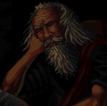
09-28-2009, 04:21 PM
Arms are too long, if he held his arms straight down they'd probably go to his kneecaps, an arm goes to about halfway on your upper leg.
That said, the colors aren't bad, but try to utilize them better. 1up's right about the anatomy sketching. Keep at it! |
|
« Next Oldest | Next Newest »
|